Forcing Breaks on Long Words and URLs
You’re a developer and you’ve just put the finishing touches on your beautiful, responsive website. It looks great on desktop, but when you check it on your phone, a single, incredibly long URL or a hyphen-less word blows your whole layout apart. Sound familiar? It’s a common problem, especially on mobile devices where screen real estate is limited. The issue is that the browser doesn’t know where to break up a single, unbroken string of text, so it simply overflows its container.
This post provides a simple, foundational CSS fix.
This usually comes handy when URLs overflow in mobile devices.
Replace .dont-break-out with the element in use.
/*------------------------------------*\
Forcing Breaks, Hyphenation, Ellipsis
\*------------------------------------*/

.dont-break-out {

  /* These are technically the same, but use both */
  overflow-wrap: break-word;
  word-wrap: break-word;

  -ms-word-break: break-all;
  /* This is the dangerous one in WebKit, as it breaks things wherever */
  word-break: break-all;
  /* Instead use this non-standard one: */
  word-break: break-word;

  /* Adds a hyphen where the word breaks, if supported (No Blink) */
  -ms-hyphens: auto;
  -moz-hyphens: auto;
  -webkit-hyphens: auto;
  hyphens: auto;

}
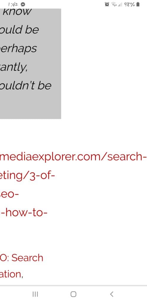
Before and after (mobile version)


Thanks to https://css-tricks.com/snippets/css/prevent-long-urls-from-breaking-out-of-container/
A Modern Approach to CSS Word Breaks
The original code snippet provides a solid starting point, but a modern developer can achieve the same results with more concise, better-supported code. Let’s break down the individual properties and their modern usage.
overflow-wrap: break-word: This is the modern, standard property forword-wrap. It instructs the browser to break an unbreakable string (like a long URL) at an arbitrary point if placing the entire string on one line would cause it to overflow its container. This is often the safest and most effective solution.word-break: break-all: This property is more aggressive. It tells the browser to break between any two characters to prevent overflow. While effective, it can lead to awkward line breaks within words that are not necessarily overflowing. It should be used with caution, particularly in languages with specific word-breaking rules.hyphens: auto: This property is an elegant solution that adds a hyphen where a word breaks, creating a more professional look. To work correctly, it requires you to declare the language of the content using thelangattribute on the HTML element. For example,<html lang="en">. The use of vendor prefixes (-ms-,-webkit-) is now largely unnecessary due to widespread browser support.
Adding an Ellipsis to Long Text
What if you don’t want to break a long string, but instead, you want to truncate it and add an ellipsis (…) to indicate that the text continues? This is a common pattern for titles or short descriptions. You can achieve this with a combination of three simple CSS properties.
.truncate-text {
  white-space: nowrap;
  overflow: hidden;
  text-overflow: ellipsis;
}
white-space: nowrap;prevents the text from wrapping to a new line.overflow: hidden;clips any text that overflows its container.text-overflow: ellipsis;adds the ellipsis (...) at the point where the text is clipped.
Note that this technique is best for single-line containers. Applying it to multiple lines of text is more complex and often requires a JavaScript solution for cross-browser consistency.
Tool Recommendations Section
- MDN Web Docs: The definitive resource for modern CSS properties and browser compatibility tables. A must-visit for any front-end developer.
- Can I use…: An invaluable tool for checking the support of a new CSS property across different browsers and versions.
- Visual Studio Code: A popular code editor with extensions that provide real-time feedback on CSS properties and potential browser compatibility issues.
- CodePen: An online code editor that allows you to quickly test CSS snippets and share them with the community.
Conclusion
Keeping long words and URLs from breaking your design is a fundamental aspect of creating robust, responsive websites. While the original snippet provides a powerful word-break solution, combining it with modern practices like overflow-wrap, hyphens, and text-overflow gives you a full toolkit to handle any situation. By using these properties strategically, you can create a seamless experience for users on any device.
Actionable Steps:
- Replace the deprecated
word-wrap: break-wordwith the modernoverflow-wrap: break-word. - Add the
langattribute to your HTML element to enablehyphens: auto. - For titles and short descriptions, use the
text-overflow: ellipsistechnique for a clean, truncated look.
FAQ Section
What is the difference between overflow-wrap and word-break?
overflow-wrap is a standard property that breaks an unbreakable string only if it would otherwise overflow its container. In contrast, word-break: break-all is more aggressive and can break any word at any point to fit the line.
Why are there so many different hyphens properties with prefixes?
The various vendor prefixes (e.g., -moz-, -webkit-) were used to provide experimental support for new properties before they became standardized. While most modern browsers now support the standard hyphens property without a prefix, it’s still good to use them as a fallback for older browsers.
Why doesn’t text-overflow: ellipsis work on my text?
This is a common issue. To work correctly, text-overflow requires two other properties on the same element: overflow: hidden and white-space: nowrap.

